Spotify Podcast Festival 2023
EN
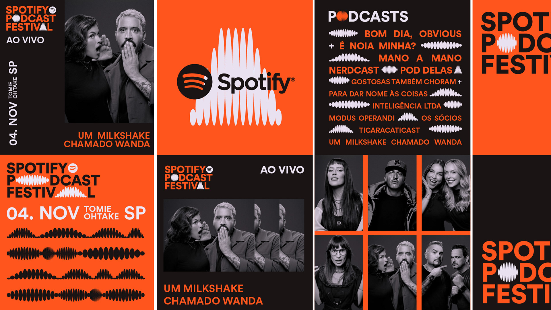
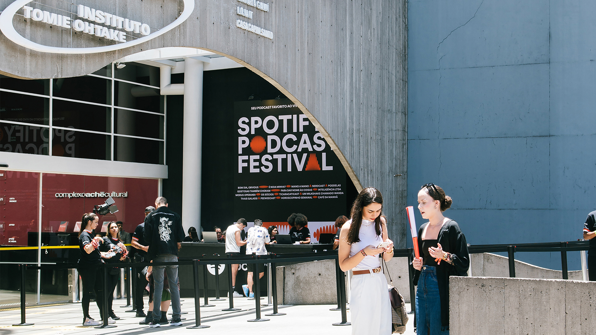
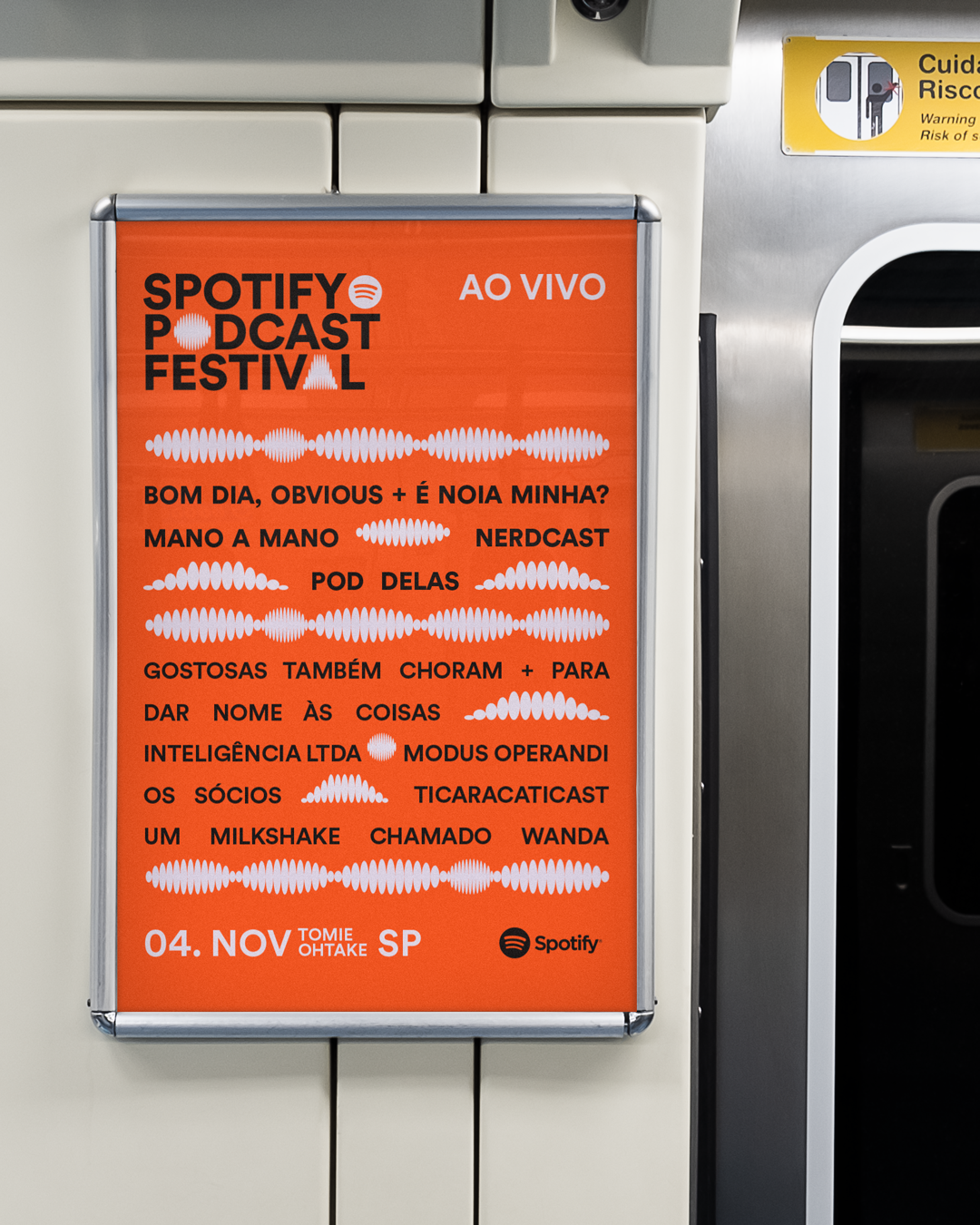
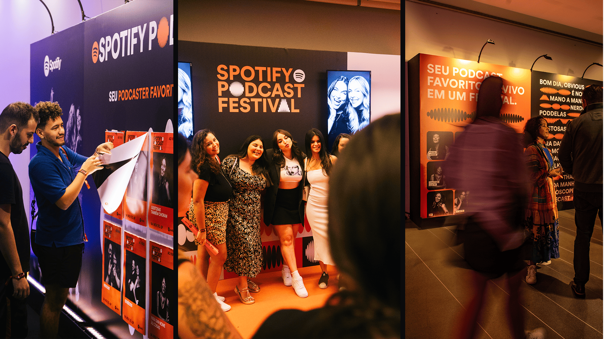
Held in 2023, the Spotify Podcast Festival aimed to create a connecting experience between fans and their favorite podcasters, bringing together some of the main names in the national podosphere for live sessions, in front of the public, at the Tomie Ohtake Institute, in São Paulo. In addition to generating immediate identification with Spotify itself, the project had an even greater challenge: transposing the idea of sound into space, giving prominence to the participating voices and generating identification with the public. The solution was an identity that symbolizes the propagation of sound waves, in their movement of expanding and retracting, a concept that was unfolded from typographic glyphs to photographic compositions, in an impactful and functional identity in its physical and digital developments.
Held in 2023, the Spotify Podcast Festival aimed to create a connecting experience between fans and their favorite podcasters, bringing together some of the main names in the national podosphere for live sessions, in front of the public, at the Tomie Ohtake Institute, in São Paulo. In addition to generating immediate identification with Spotify itself, the project had an even greater challenge: transposing the idea of sound into space, giving prominence to the participating voices and generating identification with the public. The solution was an identity that symbolizes the propagation of sound waves, in their movement of expanding and retracting, a concept that was unfolded from typographic glyphs to photographic compositions, in an impactful and functional identity in its physical and digital developments.
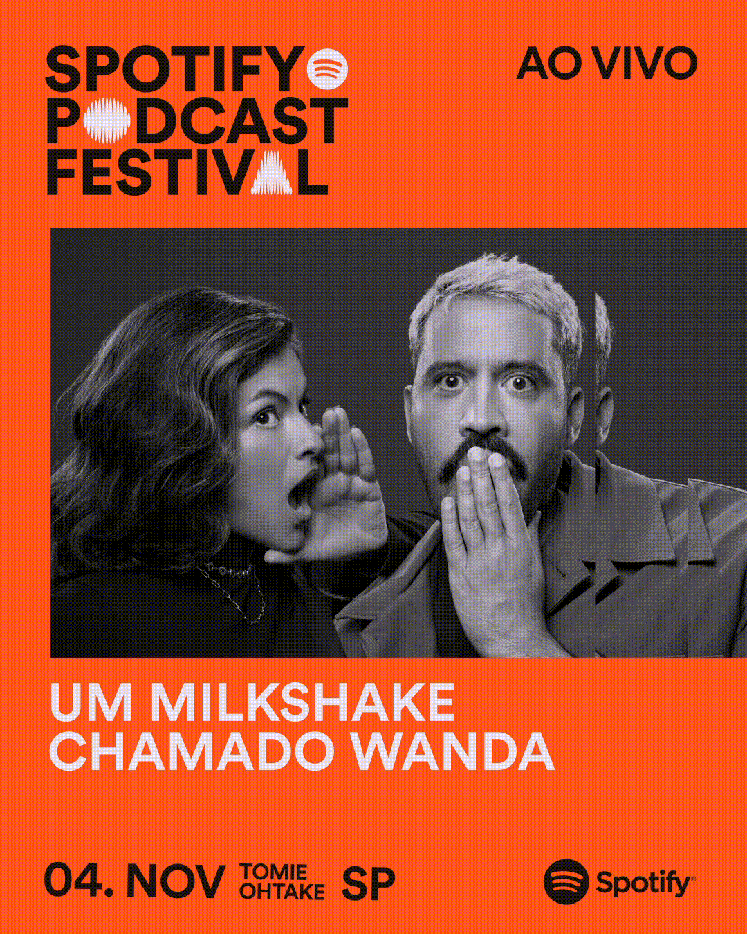
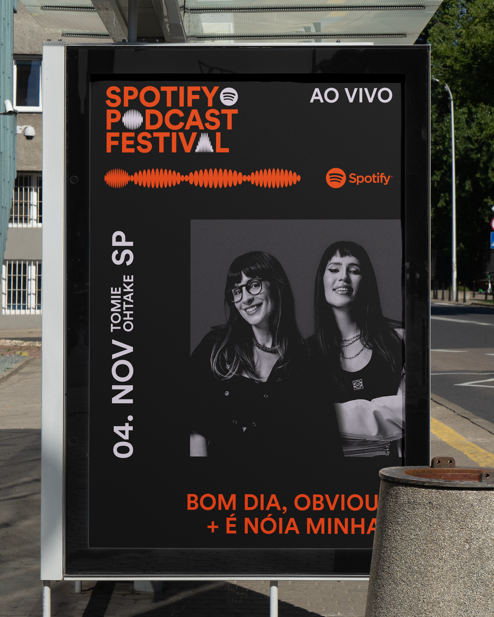
Our challenge was to create an identity that, right away, referred to Spotify and, at the same time, had its own identity, in addition to communicating the energy of a live festival and giving due protagonism to the creators. The solution was to use the same typography as the platform and explore a central element that aligns with the purpose of the event: propagating voices. Thus, graphic elements and glyphs inspired by the propagation of sound waves were created, together with photographic material highlighting the participating podcasters.
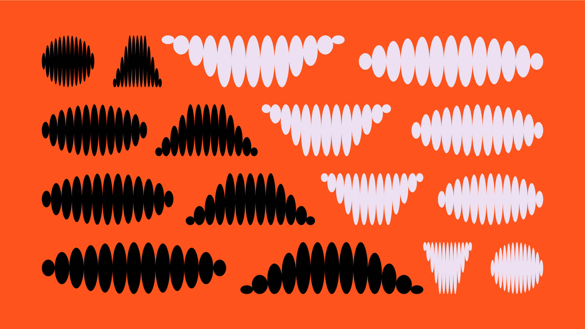
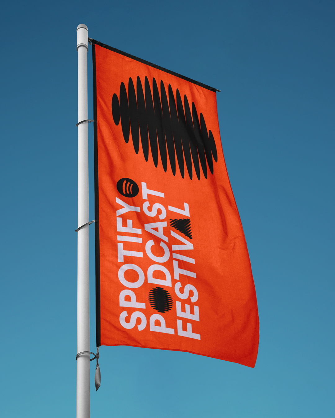
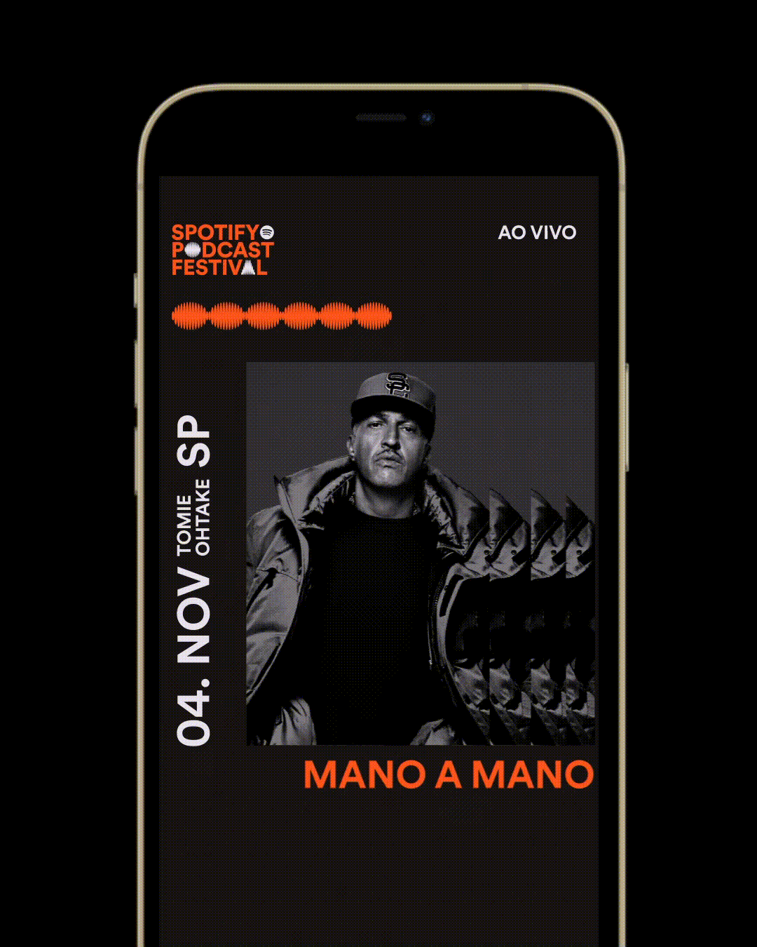
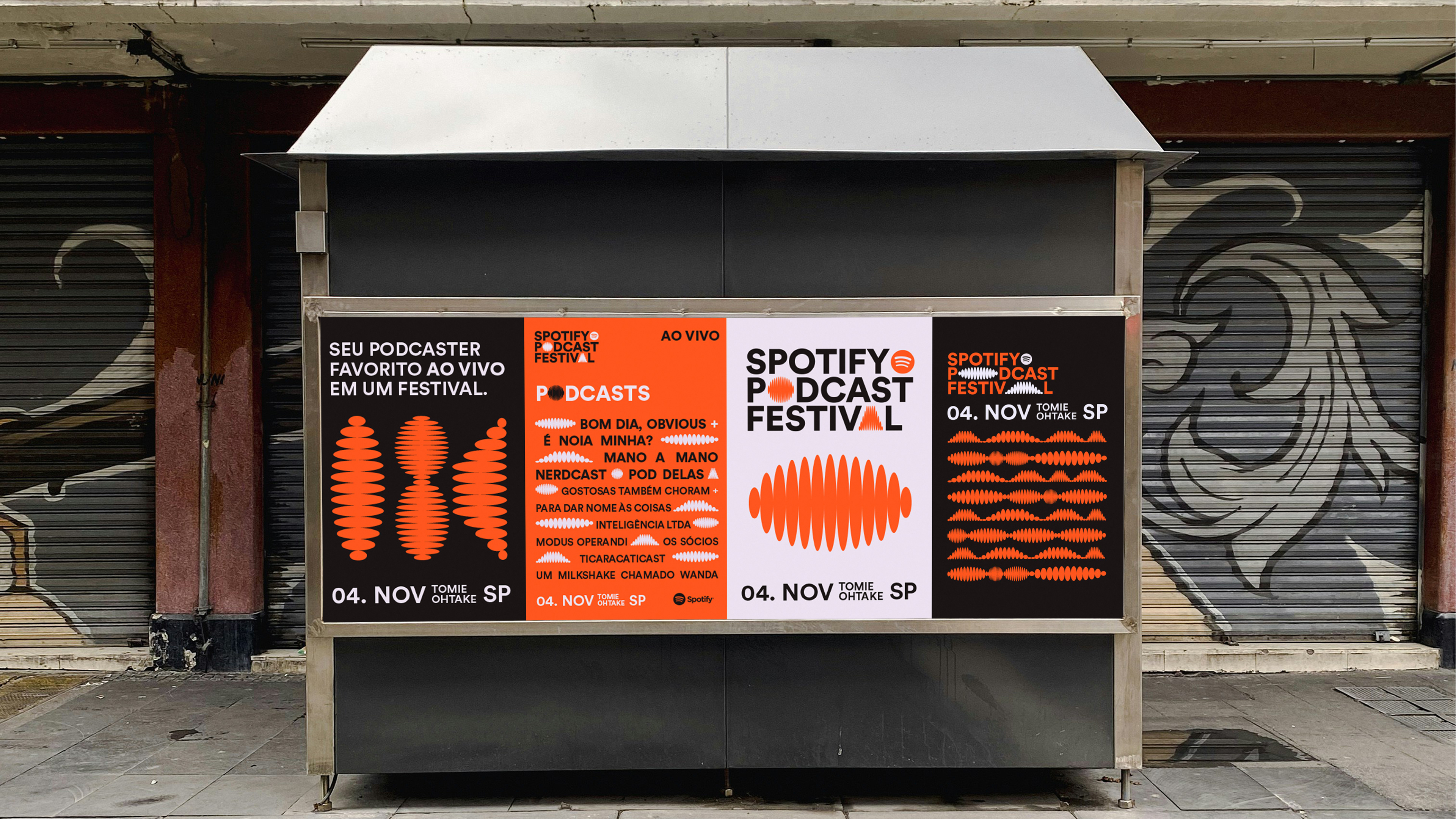
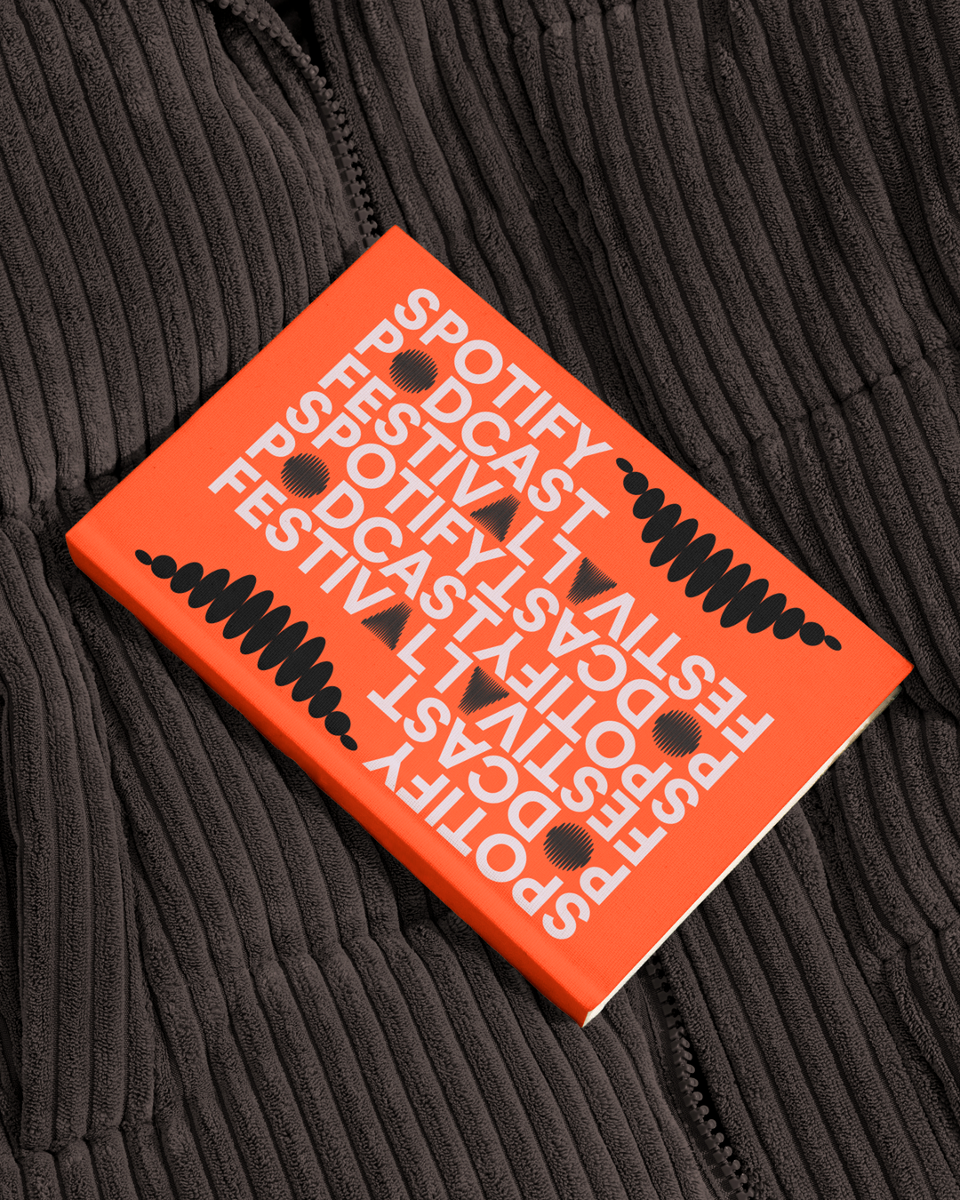
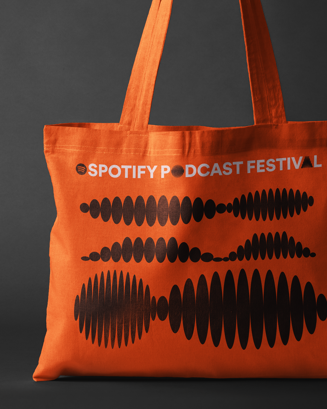
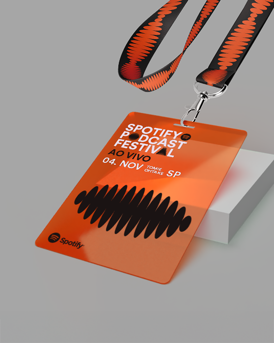
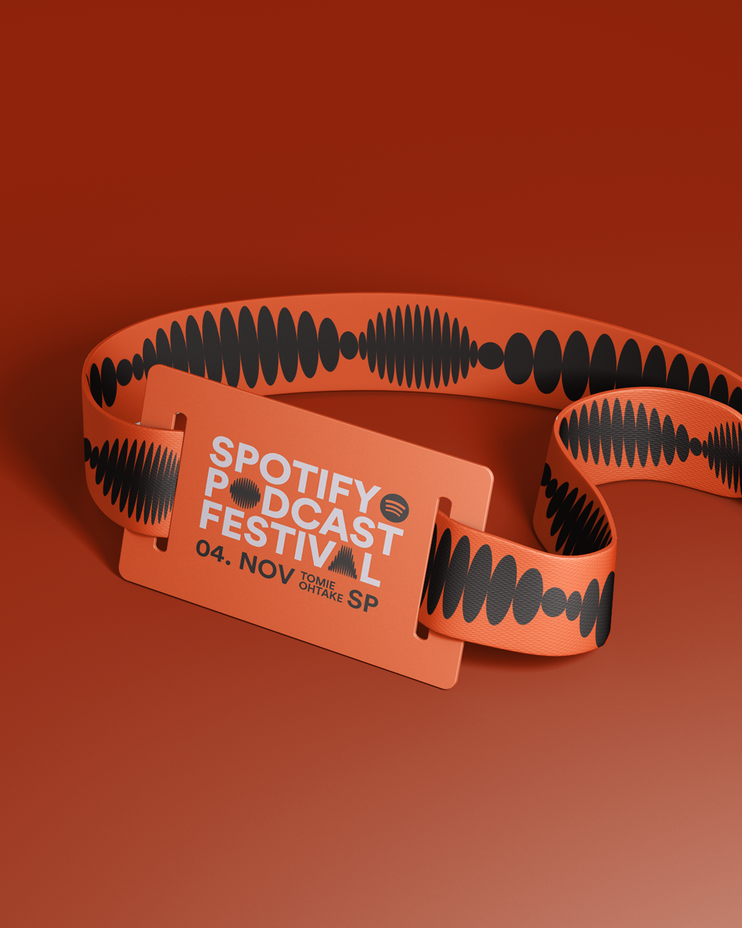
In dialogue with Spotify's identity, the visual identity and ambience of the event represent the propagation of sound waves — a graphic form that is quite recognizable in the context of audio and speech. Supported by an energetic and impactful color palette, the identity is inspired by festivals and follows this same concept from its logo to its developments in different scales and compositions. In the logo, the Festival's signature incorporates the element of reverberation in the typography itself, where the letters “O” and “A” are stylized and integrated into the typography as variable glyphs — which also allows them to be used as graphic elements. Thus, color, photography, typography and graphic elements interact in harmony, giving voice and personality to an event as iconic as its participants.
PT
Realizado em 2023, o Spotify Podcast Festival teve como proposta criar uma experiência de conexão entre os fãs e seus podcasters favoritos, reunindo alguns dos principais nomes da podosfera nacional para sessões ao vivo, diante do público, no Instituto Tomie Ohtake, em São Paulo. Além de gerar uma identificação imediata com o próprio Spotify, o projeto tinha um desafio ainda maior: transpor a ideia do som para o espaço, dando protagonismo às vozes participantes e gerando identificação com o público. A solução foi uma identidade que simboliza a propagação das ondas sonoras, em seu movimento de ampliar e retrair, conceito que foi desdobrado desde os glifos tipográficos até as composições fotográficas, em uma identidade impactante e funcional nos seus desdobramentos físicos e digitais.
Realizado em 2023, o Spotify Podcast Festival teve como proposta criar uma experiência de conexão entre os fãs e seus podcasters favoritos, reunindo alguns dos principais nomes da podosfera nacional para sessões ao vivo, diante do público, no Instituto Tomie Ohtake, em São Paulo. Além de gerar uma identificação imediata com o próprio Spotify, o projeto tinha um desafio ainda maior: transpor a ideia do som para o espaço, dando protagonismo às vozes participantes e gerando identificação com o público. A solução foi uma identidade que simboliza a propagação das ondas sonoras, em seu movimento de ampliar e retrair, conceito que foi desdobrado desde os glifos tipográficos até as composições fotográficas, em uma identidade impactante e funcional nos seus desdobramentos físicos e digitais.
Nosso desafio foi criar uma identidade que, logo de cara, remetesse ao Spotify e, ao mesmo tempo, tivesse identidade própria, além de comunicar a energia de um festival ao vivo e conferir o devido protagonismo aos criadores. A solução foi usar a mesma tipografia da plataforma e explorar um elemento central que se alinha ao propósito do evento: propagar vozes. Assim, foram criados elementos gráficos e glifos inspirados na propagação das ondas sonoras, em conjunto com o material fotográfico destacando os podcasters participantes.
Em diálogo com a identidade do Spotify, a identidade visual e ambientação do evento representam a propagação das ondas sonoras — forma gráfica bastante reconhecível no contexto do áudio e da fala. Apoiada em uma paleta de cores enérgica e impactante, a identidade se inspira nos festivais e segue este mesmo conceito desde o seu logotipo até os desdobramentos em diferentes escalas e composições. No logotipo, a assinatura do Festival incorpora o elemento da reverberação na própria tipografia, onde as letras “O” e “A” são estilizadas e integradas à tipografia como glifos variáveis — o que permite o seu uso também como elementos gráficos. Assim, cor, fotografia, tipografia e elementos gráficos dialogam em harmonia, dando voz e personalidade para um evento tão icônico quanto seus participantes.
Creative Director: Marcelo Roncatti
Design: Bárbara Luppi and Fernando Chiara
Typography: Dan Schunck
Motion: Rebeca Azevedo
Made w/ Colletivo Design