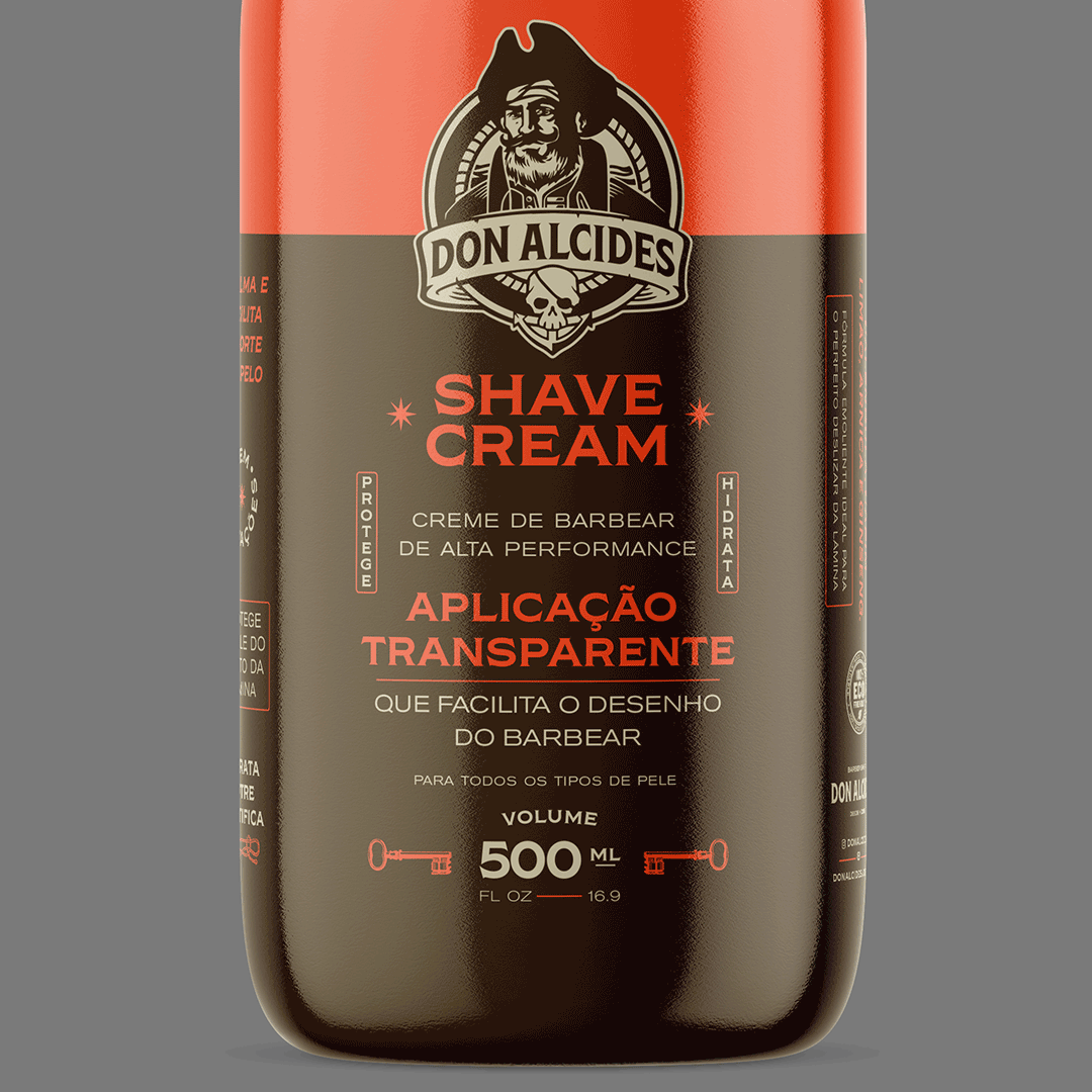
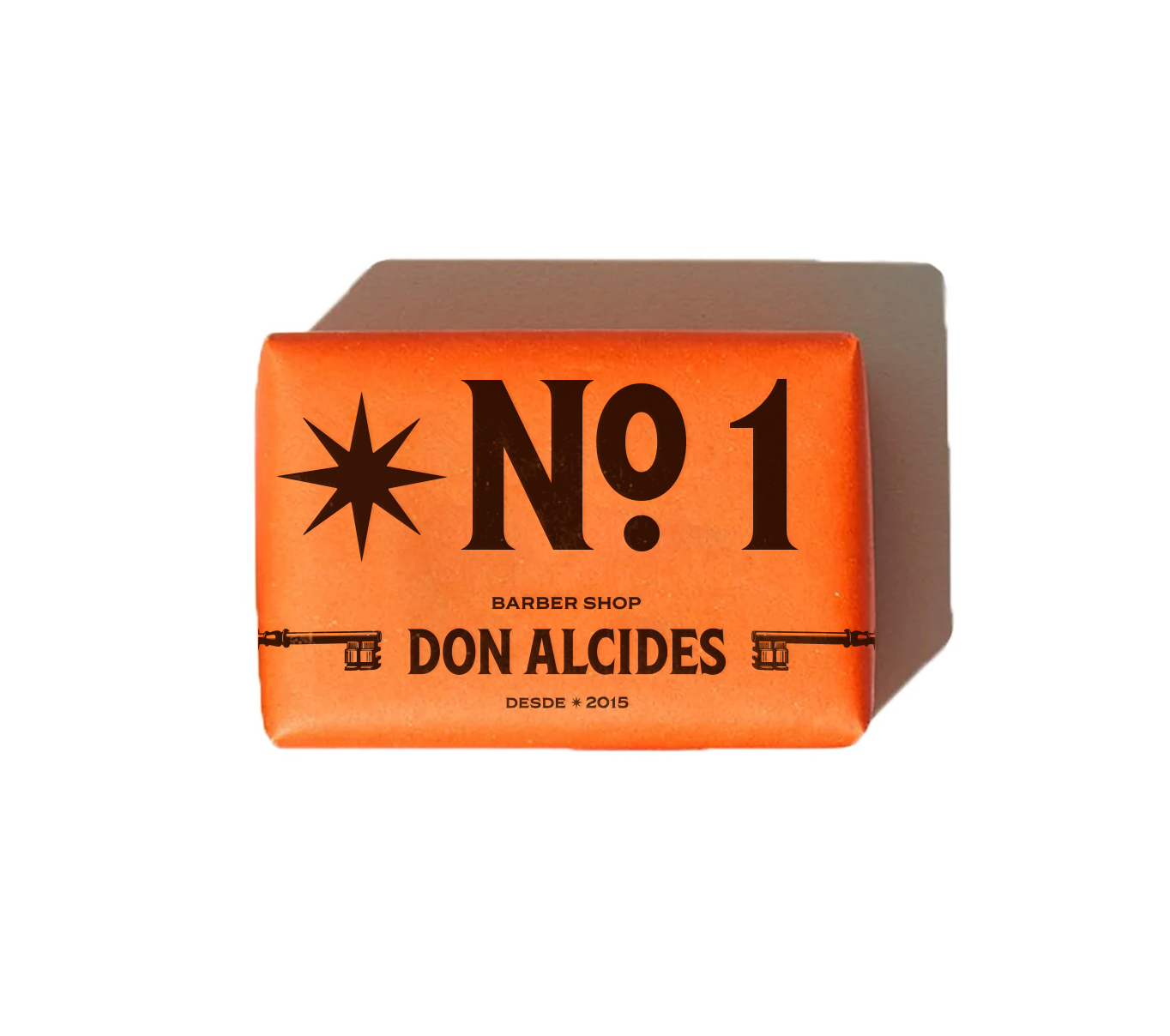
The main challenge for Don Alcides was revitalize the existing identity, bringing freshness and modernity and considering a system of flexible applications that go beyond the label, with solutions for different scales and supports. Also, create the first product of the new Don Alcides institutional line that will be the basis for the creation of future packages. And finally, incorporate into the graphic language of Don Alcides elements that connect the brand to the universe of Calico Jack.
—
Made with Estudio Bogotá, 2020
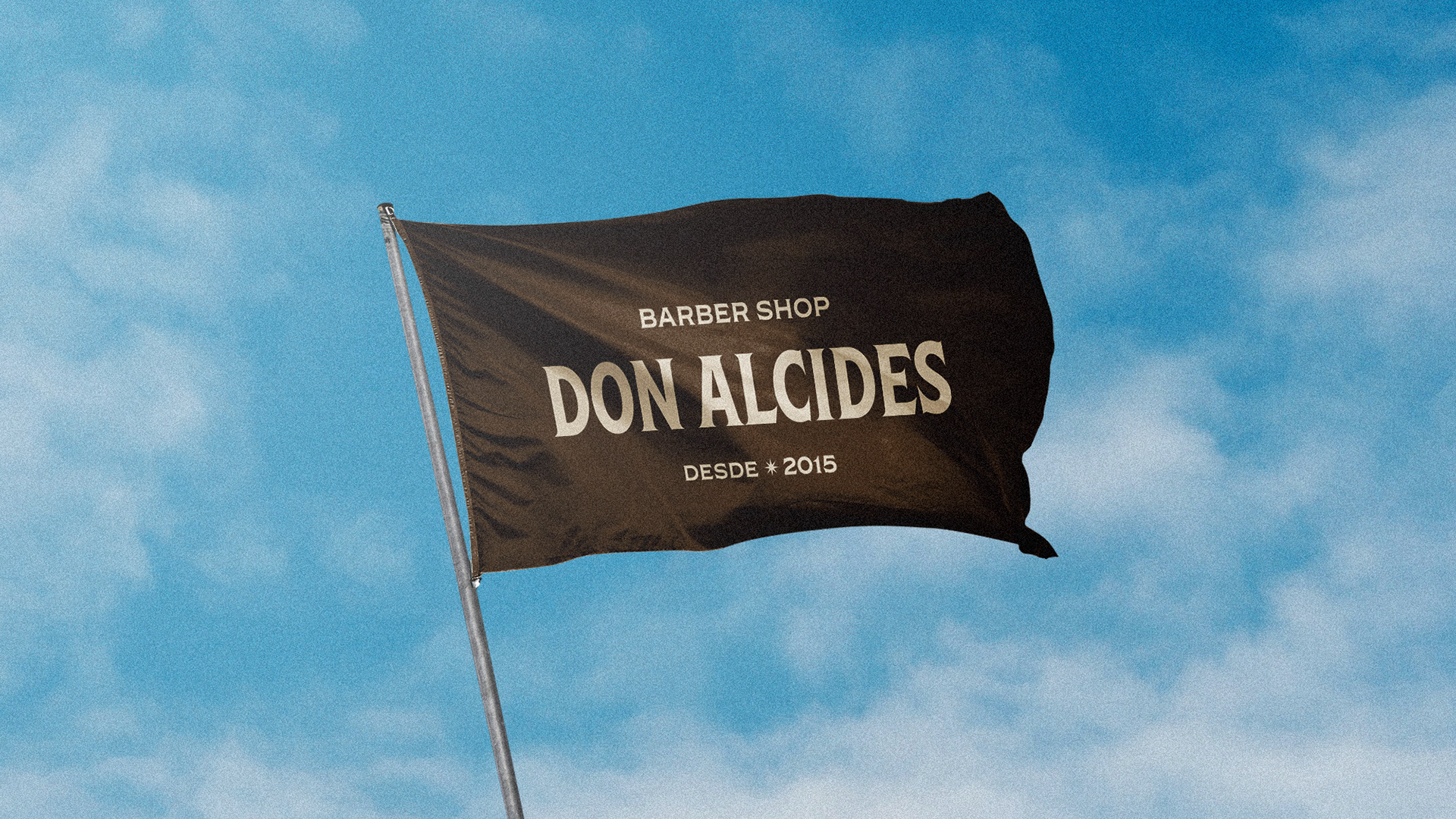
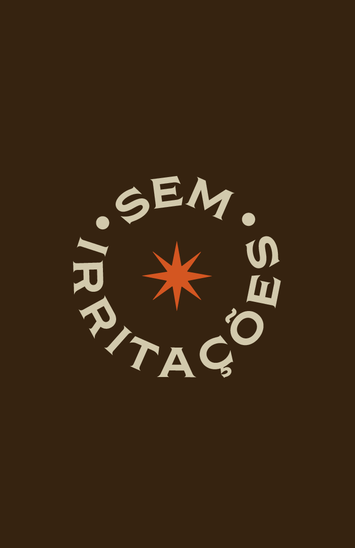
A nova solução tipográfica para o logotipo possui uma família de fontes com serifas nostálgicas,
ao mesmo tempo embutida de charme e um grau de maturidade para a marca.
ao mesmo tempo embutida de charme e um grau de maturidade para a marca.
—
The new typographic solution for the logo features a family of nostalgic serif fonts,
at the same time imbued with charm and a degree of maturity to the brand.
at the same time imbued with charm and a degree of maturity to the brand.