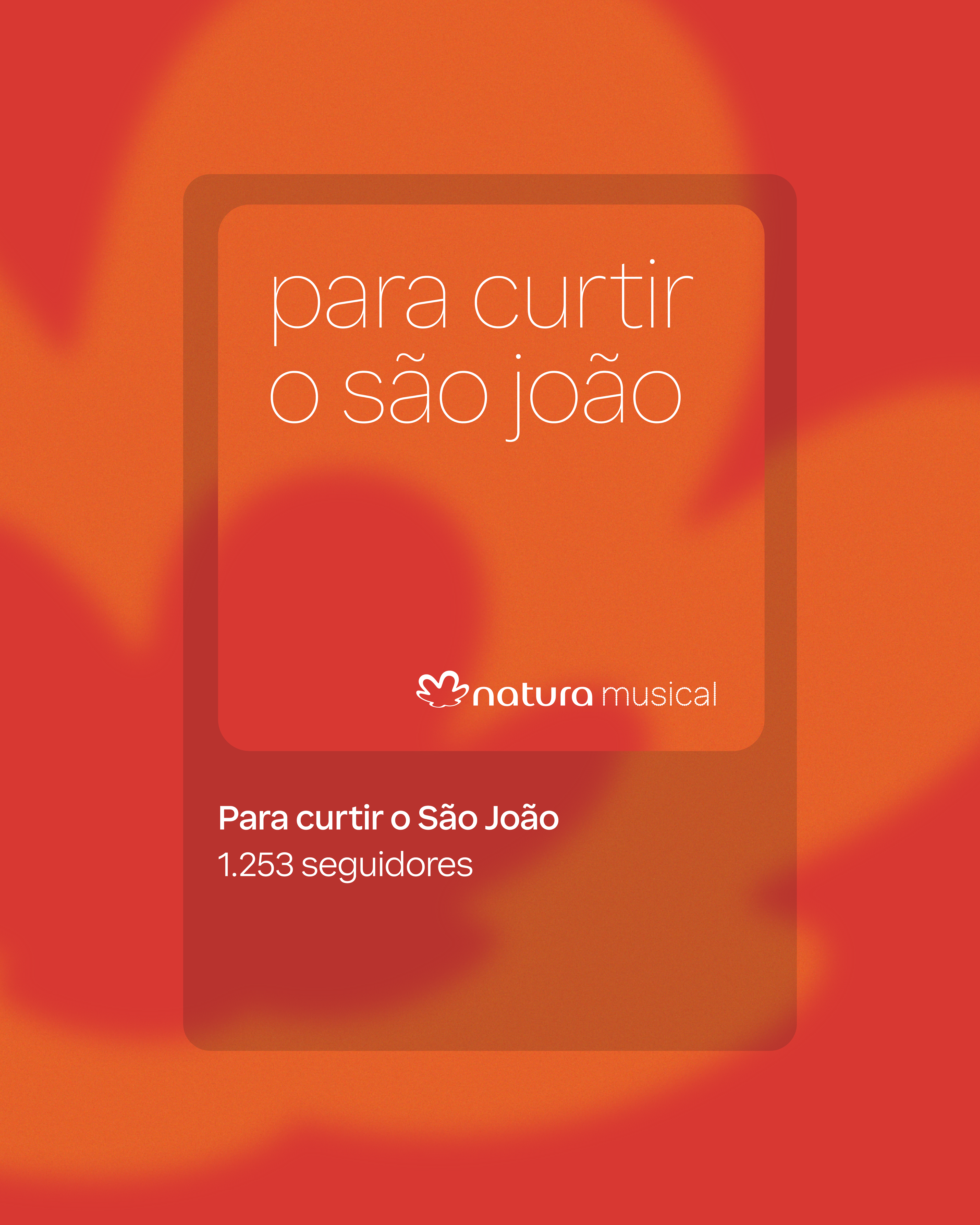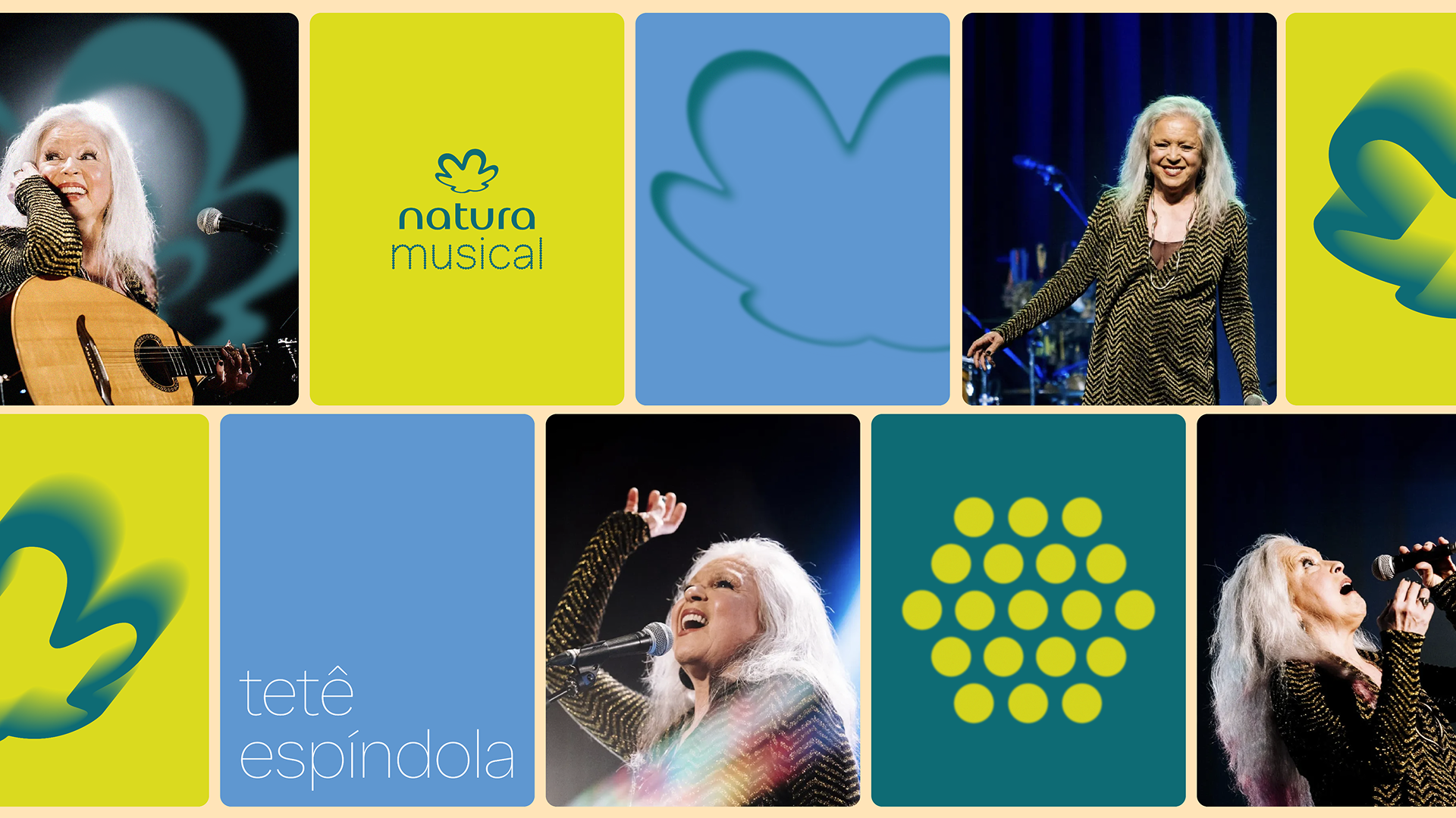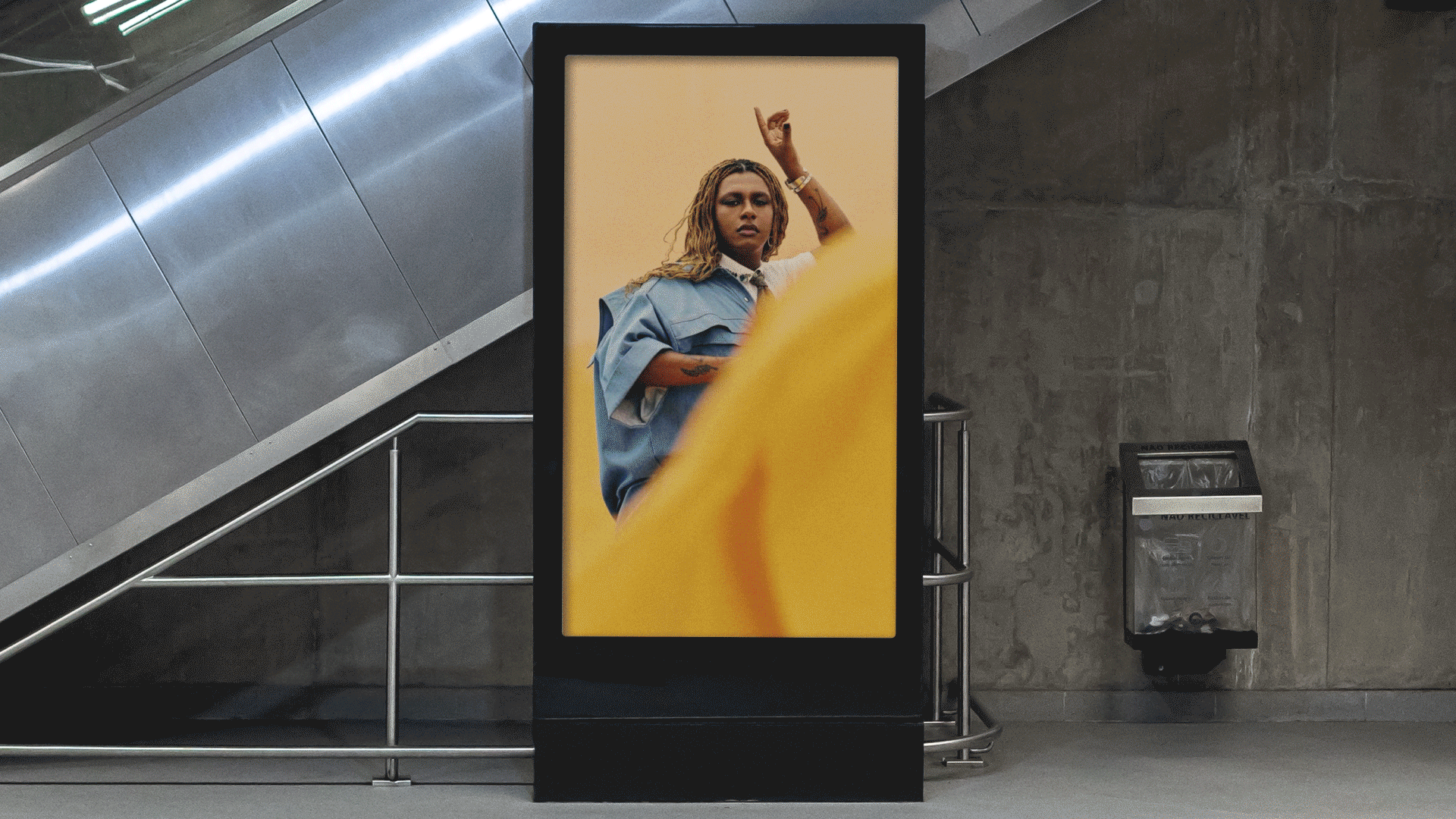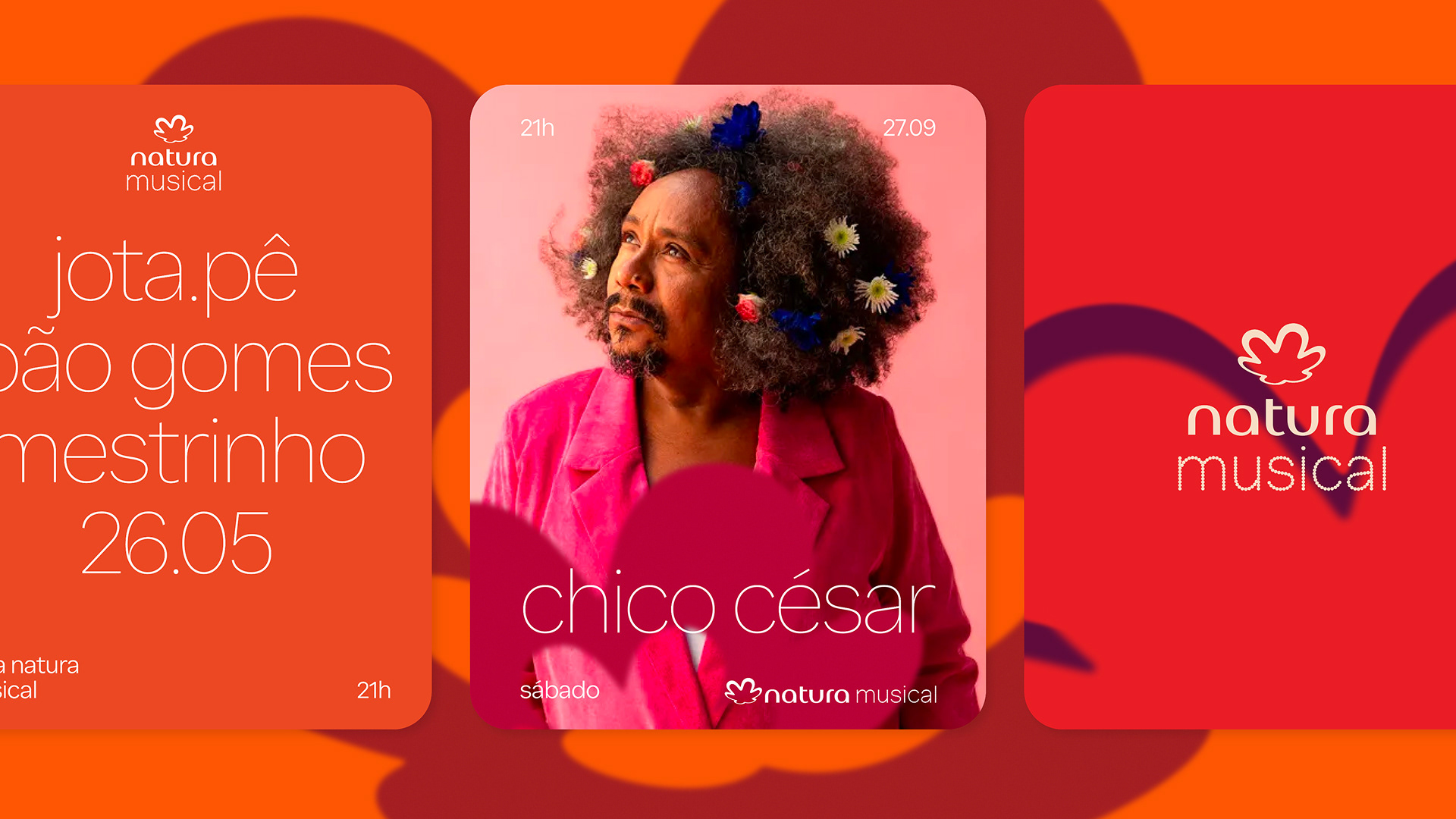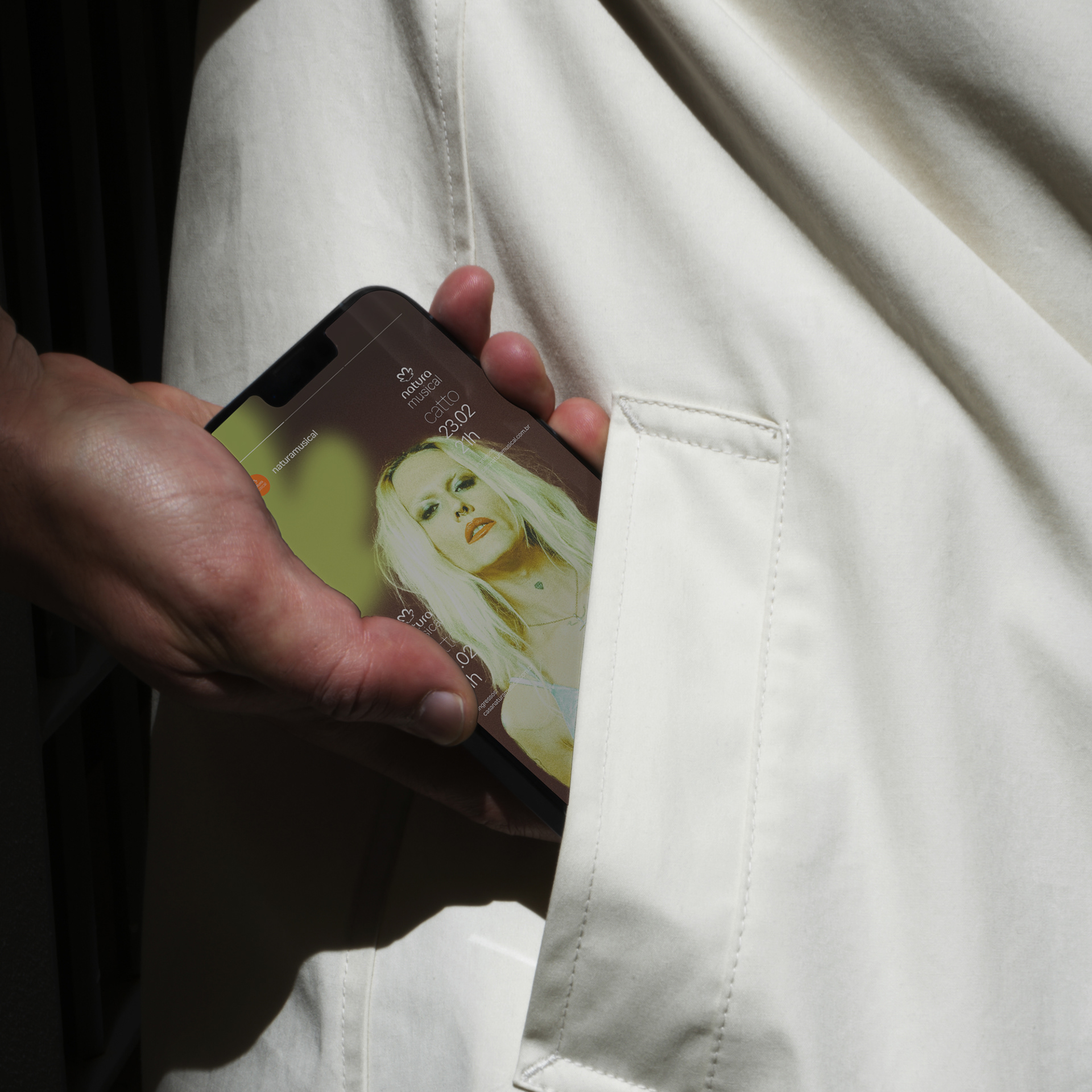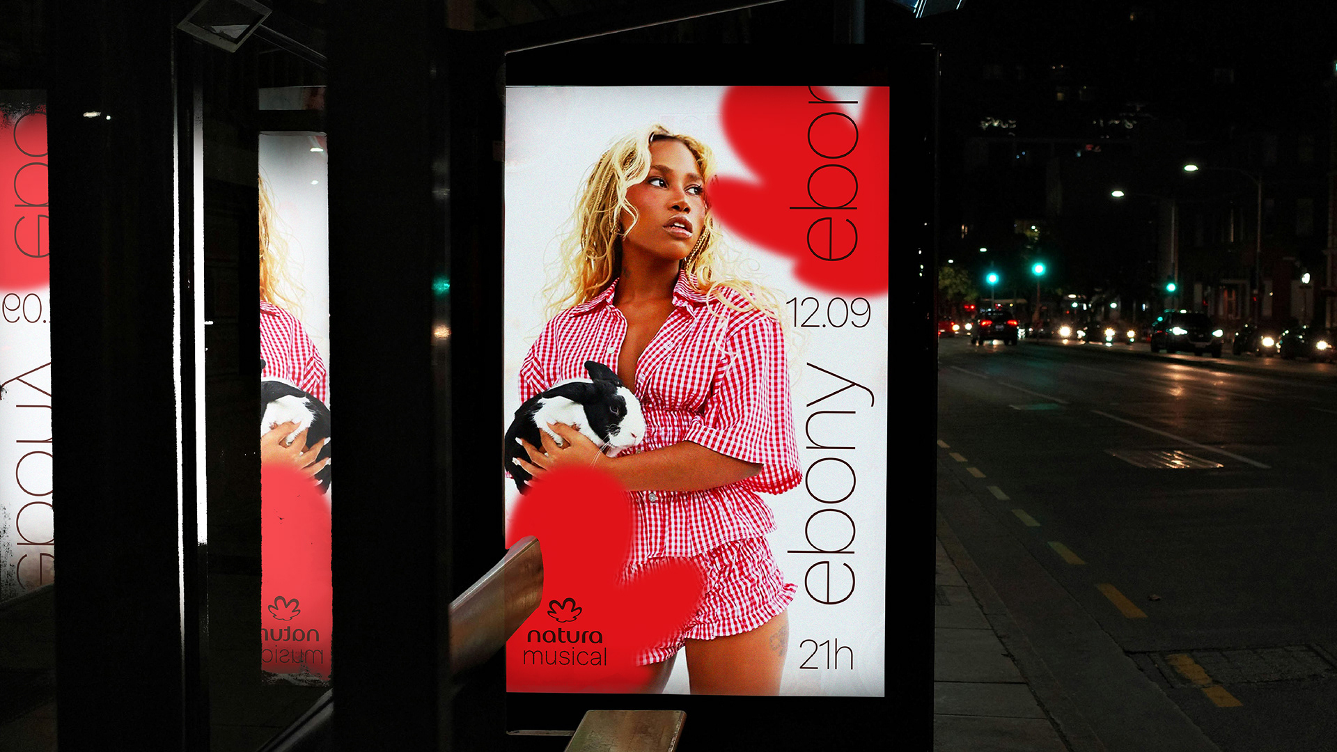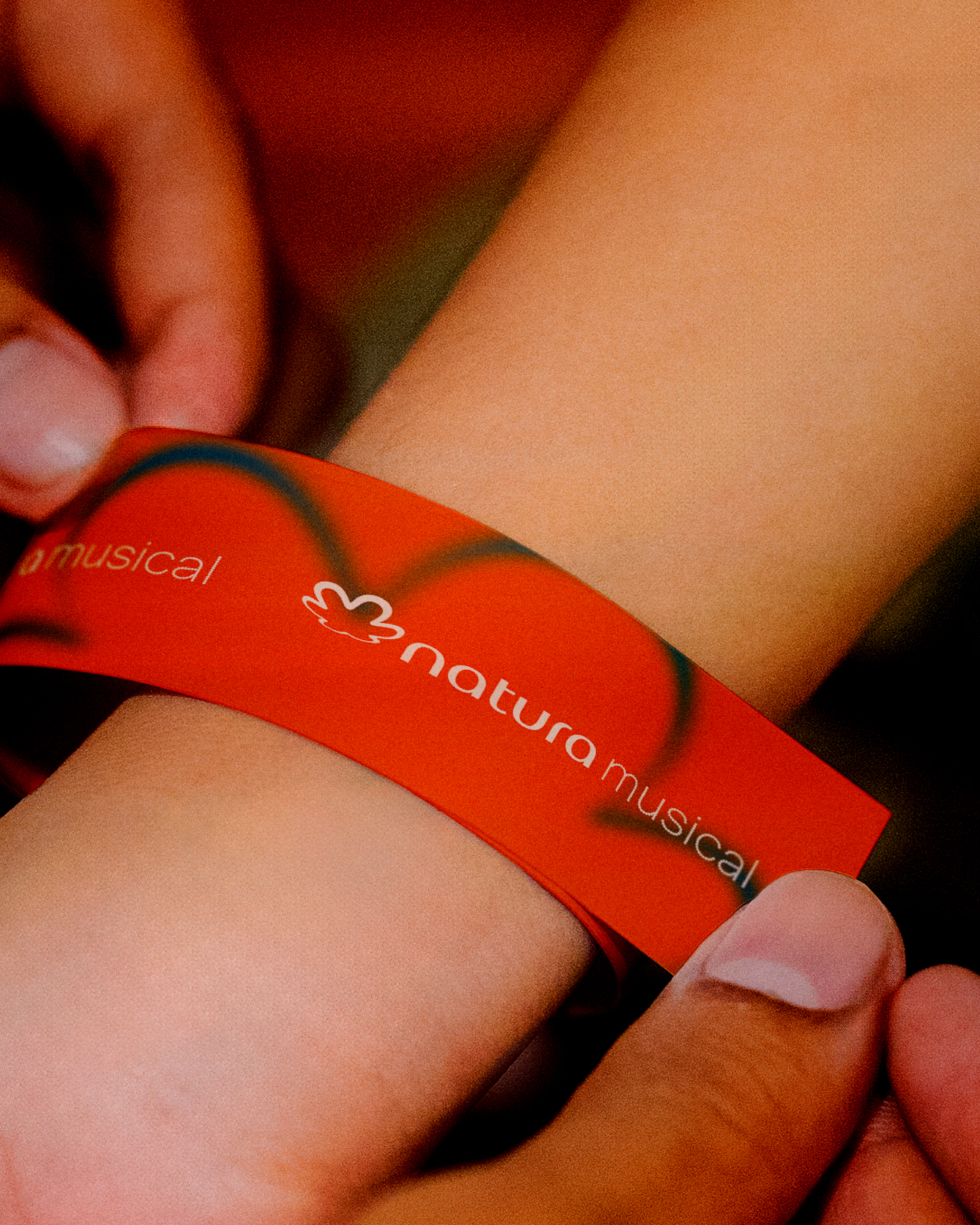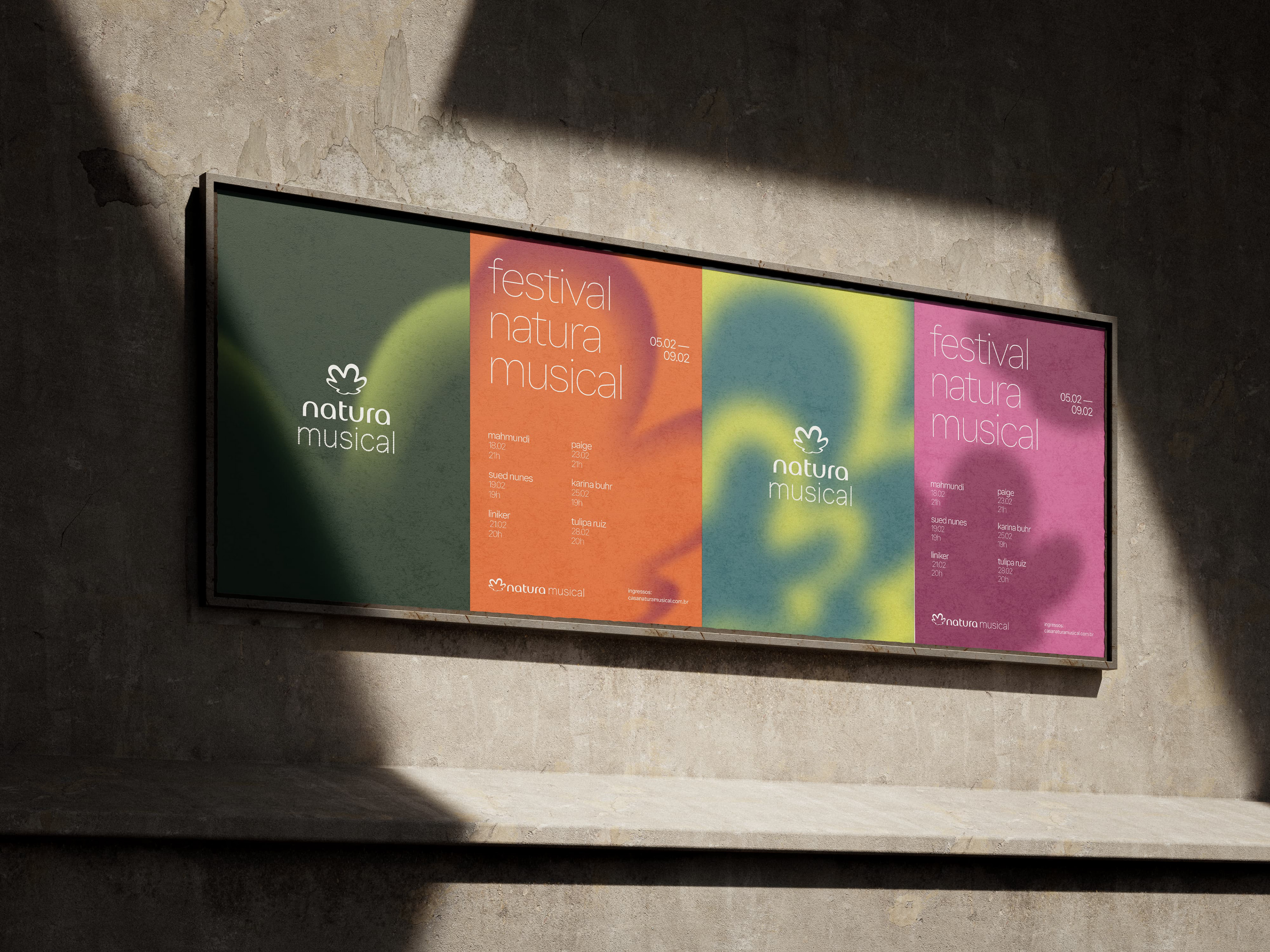
We created the new visual identity for Natura Musical, Natura’s cultural platform. After undergoing a redesign, the brand — one of the largest cosmetics companies in Brazil — saw the need to update its cultural arm as well. We were invited to develop an identity that would respect Natura’s brandbook while introducing a unique concept and language for Natura Musical, preserving recognizable elements, honoring its history, and ensuring coherence with the broader Natura universe.
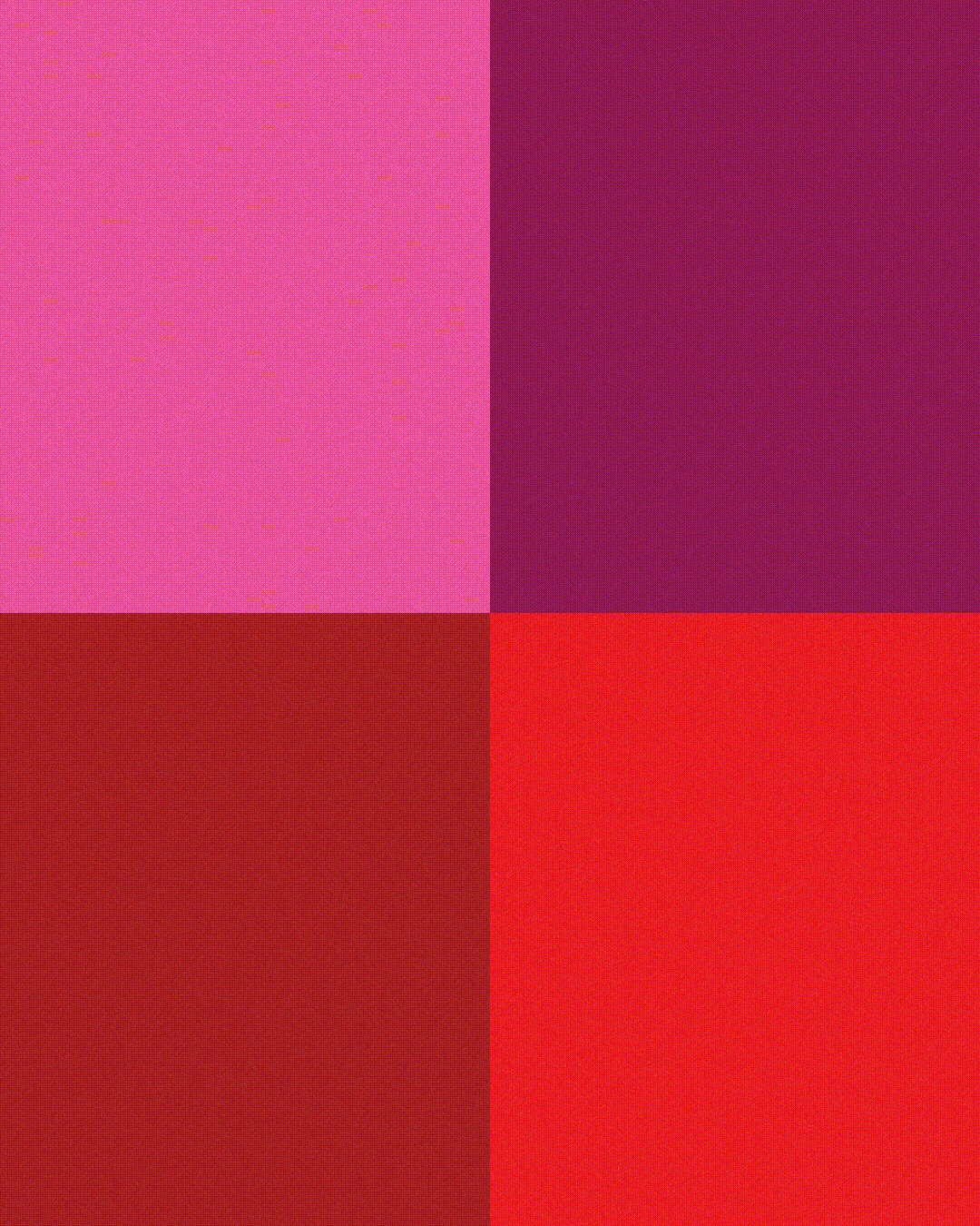
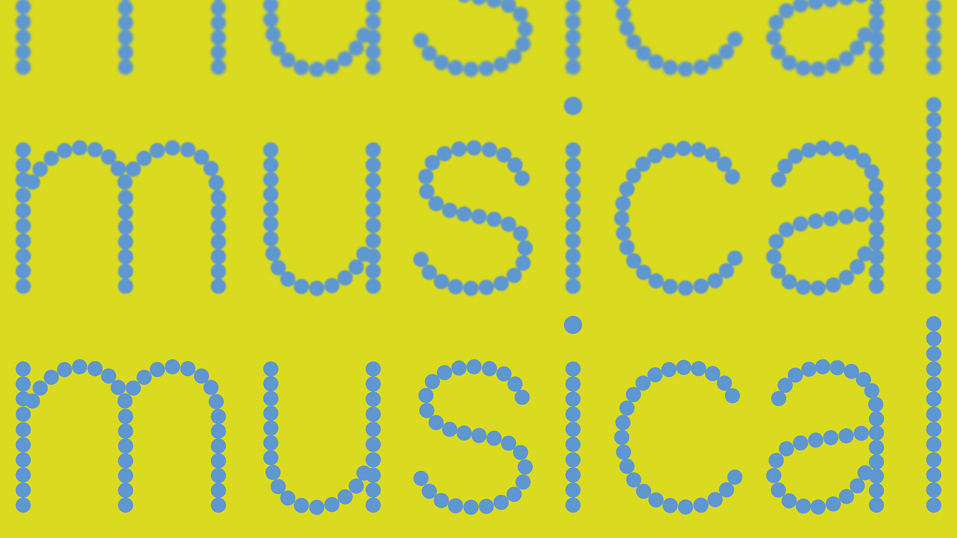
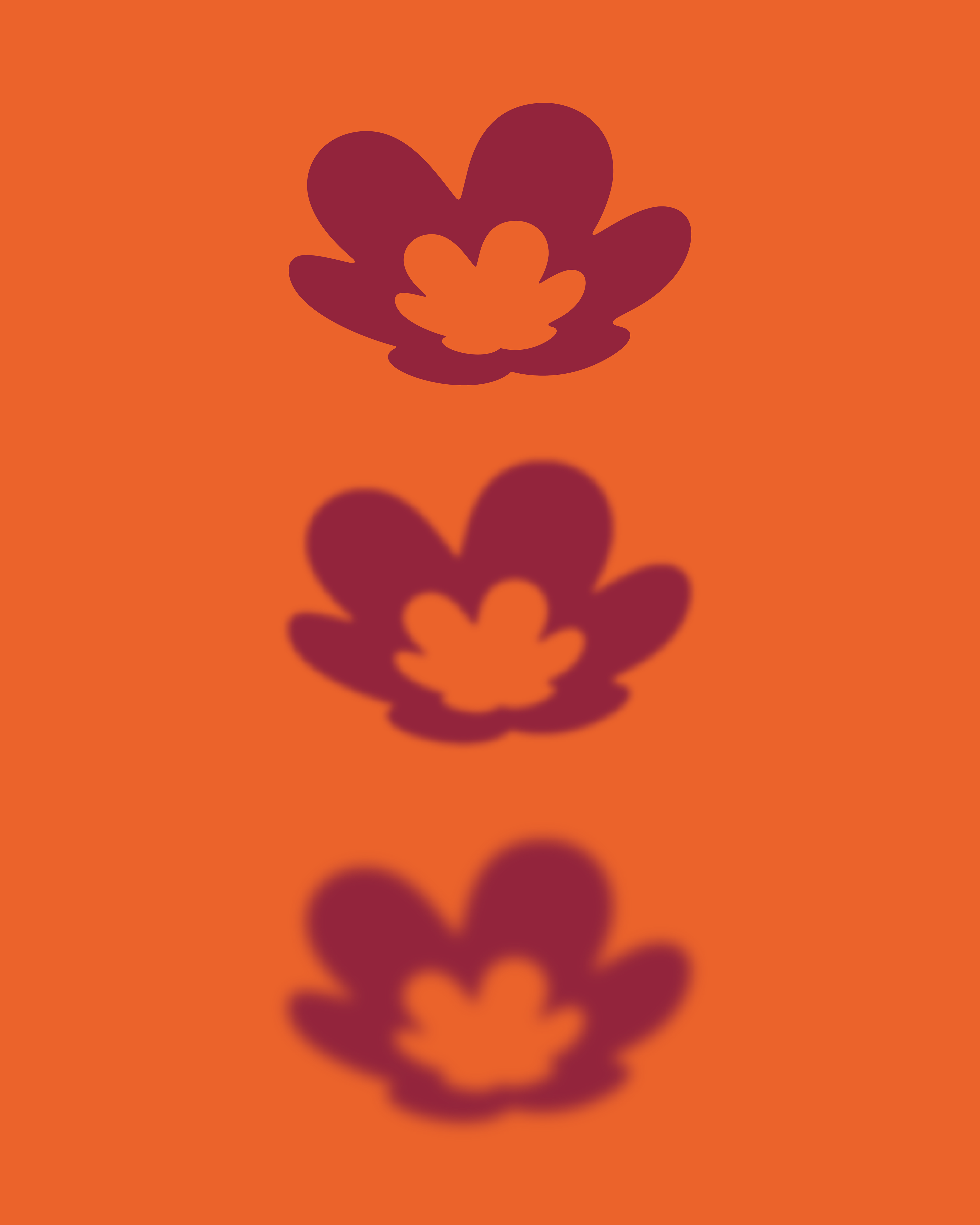
The concept emerged from the sensory experience that music provides, translated through the brand’s assets. The iconic rosacea was reinterpreted with new versions featuring light gradients and blur effects, evoking a sense of movement. Typography was rebuilt from circular shapes, inspired by stage spotlights, while the color palette expanded from Natura’s signature orange into a vibrant and diverse set of saturated tones — pink, red, lime green, and yellow. The resulting graphic system is simple, flexible, and consistent, allowing for multiple applications. With this, Natura Musical gains its own personality while remaining connected to Natura’s legacy.
New Business and Relationships — Vanessa Queiroz
Account Lead — Sabrina Silveira
Project Management — Beatriz Costa
Creative Direction — Marcelo Roncatti
Art Direction — Bárbara Luppi
Design — Artêmio Neto
Typography — Dan Schunck
Art Assistance — Fernando Chiara and Vitor Teixeira
Motion Design — Rebeca Prado
Account Lead — Sabrina Silveira
Project Management — Beatriz Costa
Creative Direction — Marcelo Roncatti
Art Direction — Bárbara Luppi
Design — Artêmio Neto
Typography — Dan Schunck
Art Assistance — Fernando Chiara and Vitor Teixeira
Motion Design — Rebeca Prado